
When comparing rich black vs 100K for book printing, use black-only artwork as the starting point for small text and fine rules, and discuss a printer-approved rich black for large solid areas. The two have different jobs. Rich black combines black with other process inks; 100K means 100% black, with no cyan, magenta, or yellow in that object’s CMYK values.
Do not apply one black treatment to every element. Backgrounds, small type, reversed white details, photographs, and one-color interiors need separate checks. The final decision depends on paper, printing process, output settings, and the intended appearance.
This guide explains which questions to ask, what to inspect in the exported PDF, and why a dark screen preview is not proof that the file will print correctly.
Rich Black vs 100K: The Practical Difference
100K specifies the black channel alone. A rich black uses black plus additional process-color components to create a different solid-black appearance. There is no single rich-black recipe suitable for every press and stock.
| Artwork | Useful starting point | Reason | Approval check |
|---|---|---|---|
| Small body text and fine rules | Black-only values | Avoids building tiny details from several process-color separations | Check the exported object’s values and legibility |
| Large black background | Printer-approved solid-black treatment, possibly rich black | Solid appearance and background interaction matter | Confirm recipe, paper, ink coverage and sample |
| White type on black | Approved knockout design | The unprinted detail must remain open and visible | Check overprint, fine strokes and registration sensitivity |
| One-color black interior | Agreed black-only workflow | Matches the intended production specification | Check images, imported artwork and unintended color plates |
| Photographic dark areas | Color-managed image appropriate to output | Dark tonal detail is different from a flat black swatch | Review separation, coverage and a representative proof |
Adobe’s How to Print Black tutorial introduces the distinction between 100% K and rich black. For a book buyer, the important step is to identify each use of black before asking the designer to change it.
A black-only object placed over a color background may print alongside underlying color because of overprinting. Its own CMYK value and the total inks present in that location are different questions. Check both before concluding that a file contains the wrong black.
Keep Small Text and Fine Rules Under Control
Start with black-only process values for ordinary small black text and fine black linework, subject to the printer’s file requirements. Multi-channel black makes those details dependent on the alignment of several separations.
In a conventional CMYK workflow, C0 M0 Y0 K100 identifies a solid black-only object. If a body-text object unexpectedly contains cyan, magenta or yellow, investigate its swatch, imported source, or export conversion. Do not decide from how dark it looks on screen.
Check captions, page numbers, footnotes, table lines and diagram labels as well as the main text. Imported vector graphics and PDF pages can carry different color definitions from the layout document.
A supplier may use a managed digital workflow with its own conversion rules. Ask how text values are preserved through that workflow rather than assuming an offset separation decision automatically describes every digital device.
If you are preparing a paperback specification, coordinate these decisions with the interior color requirements in the paperback printing guide. A one-color interior and a four-color cover can legitimately need different files and treatments.
Choose Black for Large Backgrounds
For large solid panels, ask the printer whether a rich black is appropriate and which recipe to use. Review the actual stock and finishing rather than choosing an internet formula because it looks darker on a monitor.
The additional components can affect the solid appearance and color balance. Their suitability depends on the output condition. A black background approved on one paper is not automatically equivalent on another paper or beneath another finish.
Do not use the registration swatch for normal artwork. In a typical process separation workflow, registration color is intended to appear on all separations for production marks, not to act as a premium black background.
Also distinguish a flat background from the shadows in a photograph. Replacing all dark image pixels with one rich-black swatch can destroy detail. Discuss image separation and profile conversion as an image question, separate from the vector background treatment.
Separate Black Choice from Overprint
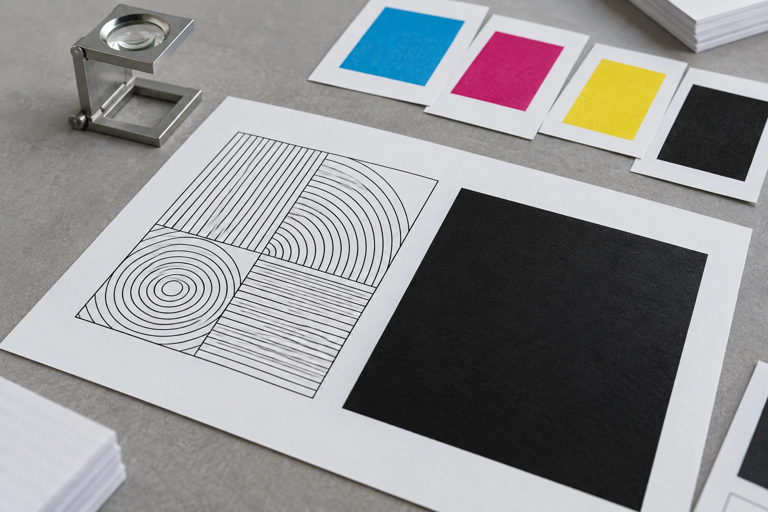
Black composition describes the inks assigned to an object. Overprint describes how it interacts with what is underneath. They are related decisions, but they are not the same setting.
With knockout, the underlying artwork is removed in the overlapping area. With overprint, underlying color can remain. Adobe’s InDesign overprinting reference discusses how black overprints can reveal underlying color and why large black areas need review.
Overprinting may be suitable for particular small black elements, while a large panel over an image can show an unwanted change where the image beneath it varies. Ask the prepress team to review the intended result instead of enabling or disabling overprint for every object at once.
Application defaults and export settings matter. Review the actual exported file with an overprint-aware preview. A layout that looks correct in a basic PDF viewer may not demonstrate the final interaction of overlapping inks.
Record the agreed treatment for backgrounds, body text and special elements. If the printer changes a setting, request the relevant revised proof before approving production.
Check White Type and Knockout Details
White type or a white logo inside a black panel usually relies on an unprinted knockout. Check that it remains visible under overprint simulation and that its fine strokes are suitable for the proposed printing condition.
Do not assign overprint to ordinary white elements that are supposed to knock out the background. They can disappear in production even if a simplified screen view initially looks normal. Adobe’s white overprint documentation addresses this output problem. Intentional white-ink printing is a separate specification and should not be confused with paper-white knockout artwork.
Small reversed details can be more sensitive than dark text on a white page. Ask the printer to review the thinnest strokes and tightest spacing. There is no universal minimum type size that covers every typeface, stock and process.
If a design combines a rich-black field with tiny reversed text, compare a more robust type treatment or a different layout. Approve the sample at a realistic viewing scale; zooming a PDF far beyond normal size does not establish reader legibility.
Review Total Area Coverage
Total area coverage is the combined percentage of process-ink components at a location. Obtain the acceptable limit for the selected output condition from the printer; do not assume one percentage applies to every book.
Illustrative arithmetic only: A hypothetical CMYK combination of C40 M30 Y30 K100 sums to 200%. C100 M100 Y100 K100 sums to 400%. These figures illustrate addition, not recommended recipes or proof that either combination is suitable for your stock.
Coverage checking needs to include images and overlaps, not only named swatches. A panel’s object values may not describe all the ink underneath an overprinting area. Ask which output profile and coverage threshold the prepress team used for the PDF.
Do not make blind global conversions to meet a number. They can change dark image detail, neutral balance, small-text separation or spot-color intent. Have the file corrected within the agreed color workflow and review the replacement.
Inspect the Final PDF
Check separations, object values, overprint and coverage in the file that will actually be produced. Reviewing only the source document leaves export changes untested.
Adobe’s Acrobat Output Preview documentation describes separation previews, overprint simulation, color warnings and total area coverage checks. These tools help diagnose file behavior; they do not replace a suitable physical proof.
| Inspect | Question to answer | Useful evidence |
|---|---|---|
| Text object values | Does ordinary small black type contain unintended CMY? | Object inspection and relevant separations |
| Large panels | Is the composition consistent with the approved treatment? | Recorded swatch values and background review |
| Overlaps | Will underlying artwork remain where intended? | Overprint-aware preview and prepress confirmation |
| White details | Do knockout elements remain visible? | Overprint simulation and suitable printed sample |
| Coverage | Does the output meet the printer’s agreed limit? | Profile and threshold recorded with the check |
| One-color pages | Are there unintended color or spot separations? | Whole-file separation review |
When a black-looking RGB graphic is converted to CMYK, its output values depend on the conversion. It does not automatically become C0 M0 Y0 K100. Ask how black-only content will be preserved before accepting a conversion for the complete book.
Keep typography and color checks alongside the geometric file requirements covered in the printing specification. Correct black values do not fix missing bleed, a wrong trim size, or an outdated cover template.
Example Book File Review
Hypothetical sourcing case: A publisher prepares a 240-page text-heavy paperback with a one-color interior and a four-color cover featuring a large black panel. This is an illustrative review plan, not a completed Prikoro order or a tested color result.
First, the designer checks body text, running headers and line drawings for the agreed black-only output. Imported images are reviewed separately so an RGB scan does not introduce unwanted process-color components.
Next, the cover background is reviewed with the printer. The team records the approved solid-black treatment, paper, output condition, coverage limit and knockout behavior. A small white publisher mark is checked for visibility and usable detail.
Finally, the printer supplies the relevant proof or material sample. The publisher approves the cover appearance and finish separately from the interior file’s separation check. If stock or export settings change, the affected checks are repeated on the new file.
Approve Black Appearance and Finishing
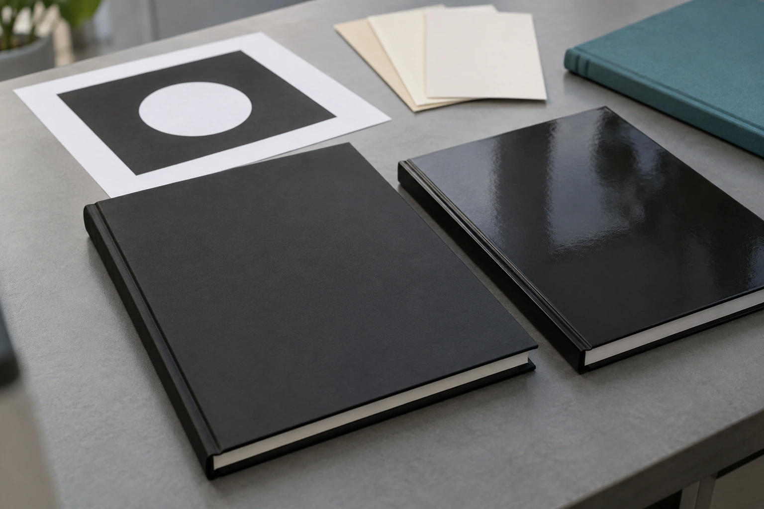
Approve a black cover with the intended stock and finish represented as closely as the chosen proof allows. Matte and glossy surfaces change the viewing experience; a photo of a sample is not a calibrated comparison of ink recipes.
| Approval item | Record | When to revisit |
|---|---|---|
| Interior black | Color specification and checked PDF version | Imported artwork or export workflow changes |
| Cover solid black | Printer-approved composition and output condition | Stock, process or profile changes |
| Overprint and knockout | Intended behavior of critical overlaps and white details | Layout or prepress corrections |
| Physical appearance | Relevant proof or sample and its limitations | Material or finish changes |
| Production handoff | Final file name, version and written approval | Any replacement file is supplied |
For hardcover book projects, include the case material and finishing in the review. For art books, evaluate dark photographs alongside flat black areas so shadow detail is not sacrificed for a darker-looking panel.
Use the proof approval guide to match the proof to the question. You can send Prikoro your representative black artwork and book specification to discuss file and sample requirements. Related guidance is available in the book manufacturing articles.
The useful rich black vs 100K decision is specific to the artwork. Keep small details under control, approve large solid treatments with the printer, and verify the final PDF and relevant sample before production.
Frequently Asked Questions
What does 100K mean in book printing?
It means 100% black in the object’s process-color values. For a black-only CMYK object, cyan, magenta and yellow are zero. Underlying artwork may still contribute ink if that object overprints.
Should all black book text use rich black?
No. Black-only values are the usual starting point for small text and fine rules. Confirm the supplier’s workflow and check the final exported values rather than applying a multi-ink black globally.
What is the best rich-black CMYK recipe?
There is no universal recipe. Ask the printer for a treatment appropriate to the paper, output condition and intended solid appearance, then approve a suitable sample.
Is registration black the same as rich black?
No. Registration color is intended for production marks that appear on separations. Do not use it as the normal black fill for book text or backgrounds.
Should every black object overprint?
No. The correct behavior depends on the object and underlying artwork. Review small text, large panels and critical overlaps separately, using the final PDF’s overprint-aware preview.
Why did white lettering disappear from a proof?
An unintended overprint setting is one possible cause. Check whether the white element is supposed to knock out the background, then inspect the final file and request a corrected proof.
Does black-looking RGB artwork become 100K?
Not automatically. CMYK conversion depends on the color workflow and can introduce other process components. Inspect the converted object or image before approving black-only output.
Can I approve a black cover from a screen image?
A screen preview can help assess layout and file interactions, but it cannot fully establish printed solid appearance or surface finish. Use a relevant physical proof or material sample when those characteristics matter.
Sources and Further Reading
The official Adobe references linked in the relevant sections support black definitions, overprint behavior and PDF inspection. The procurement checklists and hypothetical review plan are editorial recommendations, not factory test results or universal ink specifications.
- Adobe Learn — How to Print Black.
- Adobe InDesign — Overprinting.
- Adobe Acrobat — Previewing Output.
- Adobe Illustrator — White Overprint.